
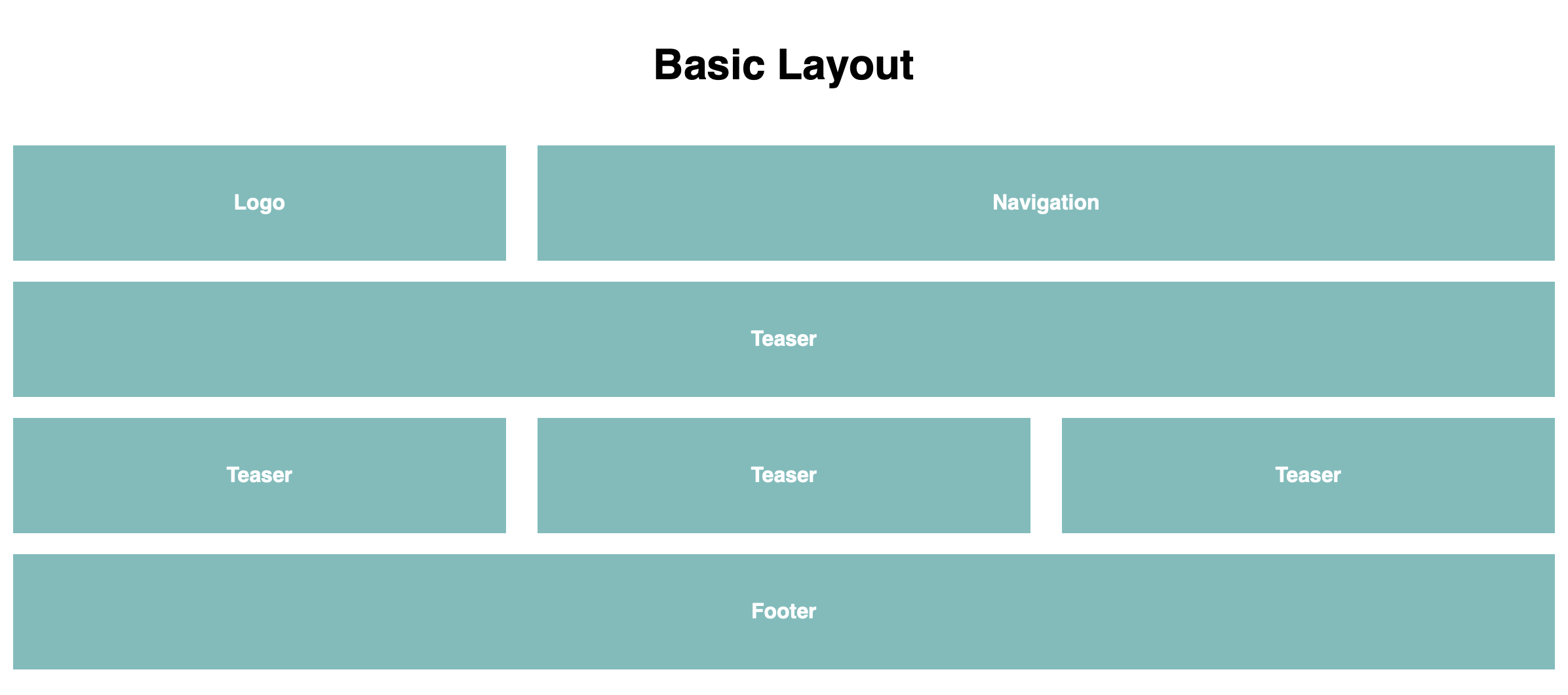
Webdesign-Grundlagen sind im Online-Marketing von großer Bedeutung, um Seitenstrukturen und technische Zusammenhänge verstehen zu können. Das nachfolgende Basic Layout steht stellvertretend für viele Websites und zeigt einen sinnvollen Aufbau in HTML und CSS.
HTML
<!DOCTYPE html>
<html>
<head>
<meta charset="UTF-8" />
<meta name="viewport" content="width=device-width, initial-scale=1">
<title>Basic Website Layout</title>
<body>
<!– 48fps –>
<h1>Basic Layout</h1>
<div class="wrapper draft">
<header class="row">
<div class="column span_2">
<span>Logo</span>
</div>
<nav class="column span_4">
<span>Navigation</span>
</nav>
</header>
<section class="row">
<article class="column span_6">
<span>Teaser</span>
</article>
</section>
<section class="row">
<article class="column span_2">
<span>Teaser</span>
</article>
<article class="column span_2">
<span>Teaser</span>
</article>
<article class="column span_2">
<span>Teaser</span>
</article>
</section>
<footer class="row">
<section class="column span_6">
<span>Footer</span>
</section>
</footer>
</div> <!– wrapper zu –>
</body>
CSS
/* 48fps */
/* CSS BOX MODELL */
*, *:before, *:after {
-moz-box-sizing: border-box;
-webkit-box-sizing: border-box;
box-sizing: border-box;
}
html {
font: 100%/1.5 Helvetica, Arial, sans-serif;
margin-top: 1rem;
}
h1{
text-align: center;
margin-top: 100px;
}
h2{
color: #222;
font-size: 1.3rem;
letter-spacing: 2px;
}
/* RASTER */
.wrapper {
margin: 0 auto;
max-width: 1200px;
text-align: center;
padding-top: 1rem;
}
.row {
background: #ddd;
margin-bottom: 25px;
}
.draft .row{
background: none;
}
.column{
float: left;
padding-left: 1%;
padding-right: 1%;
margin-bottom: 1rem;
}
.column span{
background: #ff4040;
display: block;
padding: 2rem;
color: #fff;
font-weight: bold;
}
/* Columns */
.span_1 {
width:16.6666666667%;
}
.span_2 {
width:33.333333333333%;
}
.span_3 {
width:50.0%;
}
.span_4 {
width:66.6666666667%;
}
.span_5 {
width:83.3333333333%;
}
.span_6 {
width:100%;
}
/* MEDIA QUERIES */
@media screen and (max-width: 800px){
.span_1, .span_2, .span_3, .span_4, .span_5, .span_6 {
width: 100%;
}
}
GESTALTUNGSRASTER
▸ Die Verwendung eines Gestaltungsrasters ermöglicht eine einheitliche und durchgängige Gestaltung der Webseite. Neben ästhetischen Aspekten kommt hierbei auch eine verbesserte Benutzerführung zum Tragen.
BEGRIFFLICHKEITEN
▸ Header – Kopfbereich der Seite
▸ Hauptnavigation
▸ Wortmarke / Logo
▸ Subnavigation
▸ Hilfsnavigation
▸ Contentbereich – Inhalte
▸ Breadcrumb-Navigation – „Brotkrumen“ zur Orientierung
▸ Footer – Fußbereich der Seite
BOX-MODELL
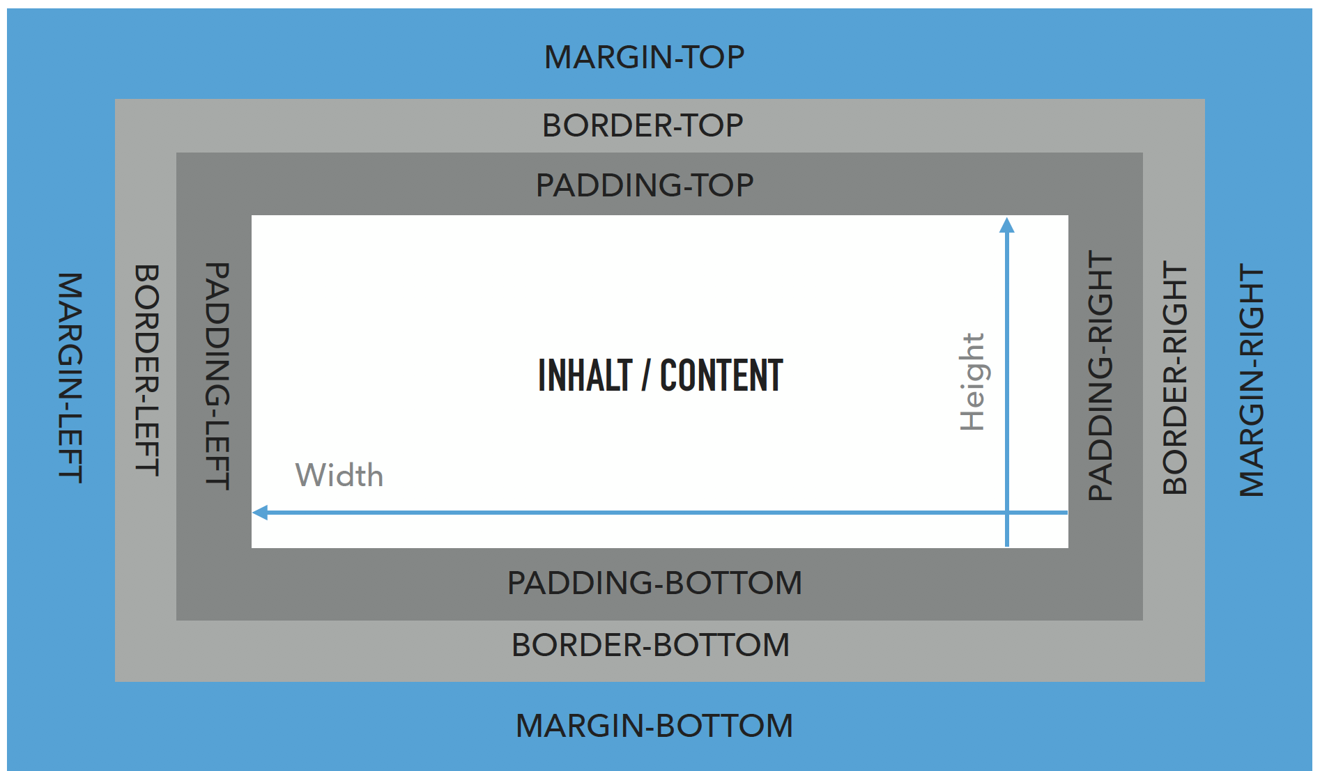
Alle HTML-Elemente kann man sich als Box vorstellen!
‣ Inhalt des HTML-Elements
‣ darum padding
‣ darum border
‣ darum margin
Padding ist der Raum zwischen Inhalt eines Elements und seinem Rahmen. Margin ist der Raum außerhalb des Rahmens um ein Element. Wenn wir wissen wollen, wie groß ein Element auf der Website ist, müssen wir das Box-Modell berücksichtigen.
HTML 5 – STRUKTUR TAGS
Mit HTML5 rückt Semantik glücklicherweise immer mehr in den Vordergrund der Web-Programmierung. Suchmaschinen können auf einer Übersichtsseite Artikel klar voneinander abgrenzen, Navigationen werden durch Sehbehinderte leichter nutzbar und so weiter (Barrierefreiheit). Die semantische Struktur beschreibt die Gliederung und den inhaltlichen Aufbau der Webseite, z. B. Kopf-, Fuß-, Navigationsbereich, Abschnitte, Überschriften, Tabellen. Diese Struktur ist unabhängig von der Formatierung und Gestaltung. article, section und nav etc. bilden die Struktur einer Webseite ähnlich wie das Inhaltsverzeichnis eines Sachbuchs in hierarchische Kapitel ab.
<section>…</section> <article>…</article> <nav>…</nav> <header>…</header> <footer>…</footer>
Responsive Design
Responsive Design ist ein gestalterischer Ansatz zur Darstellung von Inhalten auf unterschiedlichen Endgeräten. Dabei wird eine Technik genutzt, welche es ermöglicht, mit Hilfe von HTML 5 und CSS 3 Media-Queries das einheitliche Anzeigen von Inhalten auf einer Website zu gewährleisten. Das Layout einer Website wird so flexibel gestaltet, dass diese auf dem Desktop, Tablet und Smartphone eine gute Darstellung und gleichbleibende Benutzerfreundlichkeit bietet. Mit Hilfe von Media Queries werden im CSS Formatierungen für die unterschiedliche Viewports vorgenommen.
Viewport
<meta name=“viewport“ content=“width=device-width>
Viewport-Breite wird mit der Breite des Gerätes angelegt, somit entspricht die Breite des Layouts der Breite des Gerätes.
Hilfreiche Links: Self HTML